Walmart Canada
Planned and developed Walmart Canada’s corporate site refresh and CMS migration.
My Role
UX Designer, Front End Developer
The Team
Project Managers, Strategist, Graphic Designers, Copywriter, website developer, CMS Product Manager, Client Stakeholders
Tools
Adobe Illustrator, Adobe Photoshop, Brightspot CMS
Timeline
2 months
Themes
Design Research, Information Architecture, UX/UI Design, CMS Migration, Responsive Web Development, Content Development, Design Patterns, Language Localization, Project Management
Learn
Background Research, Stakeholder Interviews Content Intake
Re-Design
New content, New IA and Flow
Enhance
Updated messaging, EVP, Employer Brand
Develop
Migrate legacy content, Input new content and media, Localize content for a multilingual audience.
PROJECT OVERVEIW
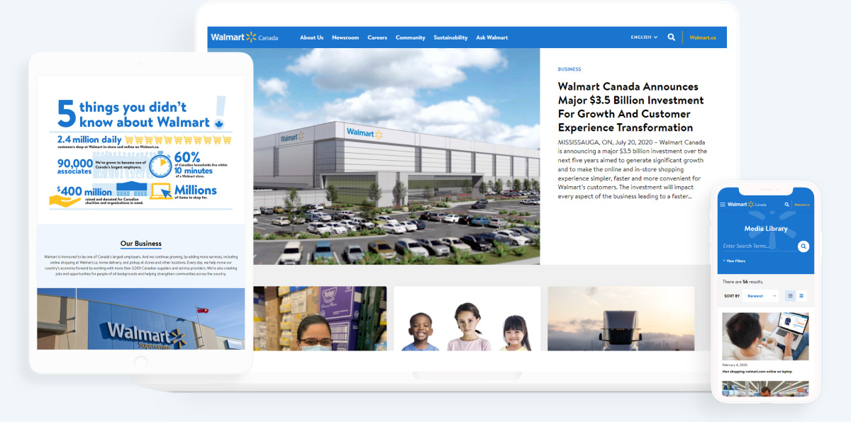
A flagship digital platform.
Walmart Canada’s corporate site is one of their most direct external channels – representing a major outlet to promote Walmart Canada as an industry leader and generate awareness for key aspects of the business.
The site would be mobile responsive and bilingual. My role was to research and provide information architecture recommendations, design wireframes, and implement all content into a new CMS as part of a legacy site migration. Walmart HR would be responsible for management and upkeep of the site post launch.
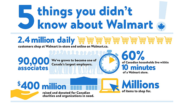
Top 10
Most influential Canadian brand.
41,000+
Full-time employees.
52,000+
Part-time employees.
PROJECT GOALS
How might we provide a candid view into all aspects of Walmart Canada from its operations, to its people, to its wider role within communities?
- Design refresh to align with AVP creative
- Organizing and distilling content and page count
- Update language and copy across the site
- UI/UX overhaul aligned to best practice
- Development support including front and back end design, and asset creation
Research
The primary objective was to ensure a cohesive Walmart narrative connected to the corporate vision, aligned to its employer brand, and reinforced across all areas of the site. The research was conducted primarily through an audit of Walmart’s existing corporate and career websites, and interviews with key HR stakeholders.
I began by taking stock of the current site, which was fragmented and contained many links and more than 45 internal pages – creating challenges for users to find relevant information quickly and at-a-glance.
HEURISTIC EVALUATION
Understanding what we’re working with.
An audit of the existing site helped to identify the following recommendations and opportunities:
- Showcase employer brand and associate value propositions
- Company values
- Working at Walmart
- Commitment to sustainability
- Community giving
- Charitable donations
- Actively ‘myth bust’ misconceptions about Walmart
- Align visuals and key messaging to careers.walmart.ca
KEY RESEARCH INSIGHT
Global Considerations.
The Content
- Reorganize and simplify content
- Providing a candid view into the employee experience
- Clearly articulate and promote Walmart’s Employer Value Proposition
- Leverage video to maximize understanding
The UX
- Refresh design and align it with current AVP creative
- Streamline site structure for quick navigation
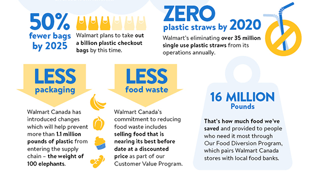
- Highlight sustainability and community giving
- Embed news feeds and press releases to keep site structure fresh
- Optimize for mobile
PRIMARY AUDIENCE
Understanding what motivates our visitors.
Media Relations
Exploratory & Focused
- Interested in Walmart as a business
- Looking for quotes, stories, stats, press releases
Vendors & Applicants
Exploratory
- Interested in Walmart as a partner/employer
- Looking for purpose, values, commitments, practices
Investors
Focused
- Interested in Walmart as a business
- Looking for reports, press releases
Design
Our guiding principles
- Minimize copy
- Incorporate a mix of high impact mediums (visuals, video, podcast)
- Adopt a user-centered design approach
- Develop simplified journey maps
- Integrate EVP messaging & creative
- Explore best/next practices (chatbots, visual job descriptions, live hiring manager)
INFORMATION ARCHITECTURE
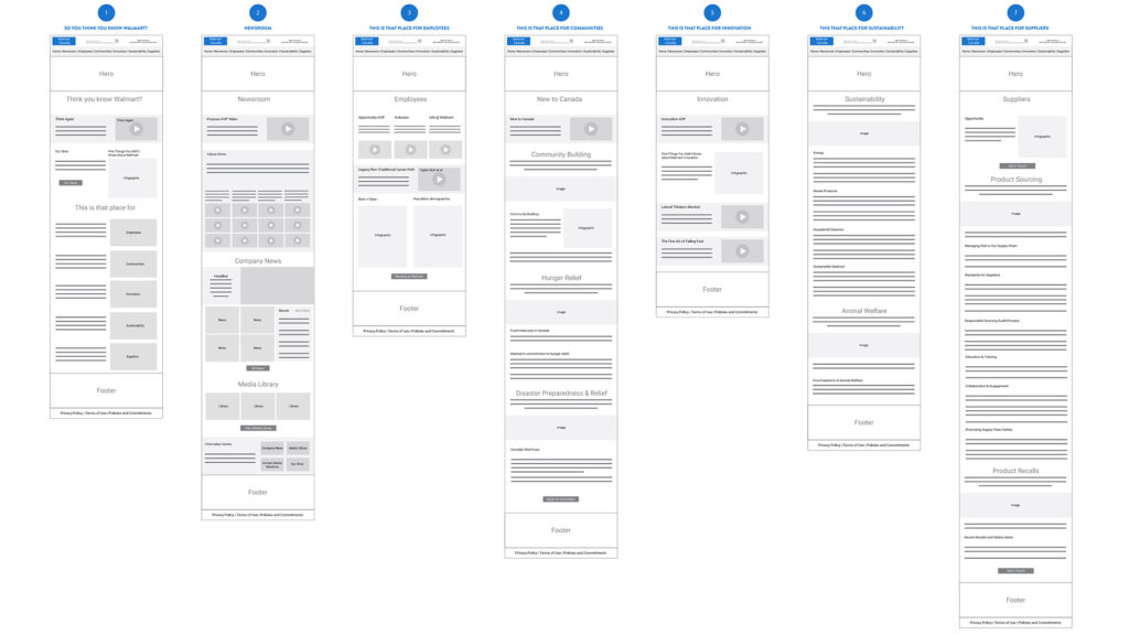
So You Think You Know Walmart.
Our team presented two different structures for our stakeholders to gut-check. A storytelling approach, and a visitor motivation approach. Each page will feature a variety of media (video and infographics) and limited copy.
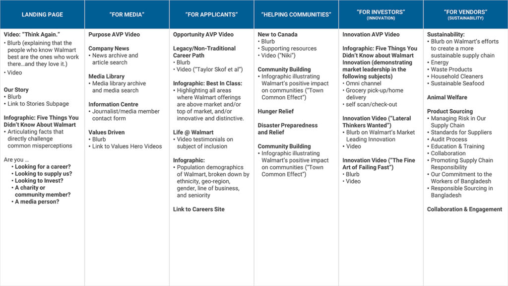
By Benefit:
A strong storytelling approach, building on common misperceptions of Walmart to create a compelling counter-narrative.
- Landing Page
- Newsroom
- Good for Workers
- Good for Communities
- Good for the Future
- Good for the World
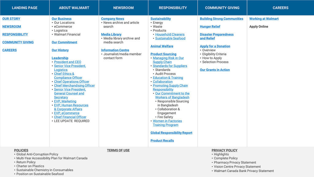
By Audience:
An intuitive user approach, serving specific user groups identified by client.
- Landing Page
- For Media
- For Applicants
- For Charities/Communities
- For Investors
- For Vendors
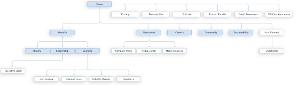
SITEMAP
Page hierarchy at a glance.
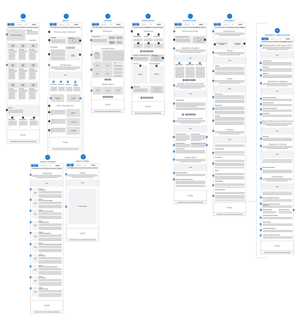
WIREFRAME ITERATIONS
Getting the content right.
Exploring the sites landing pages by audience.
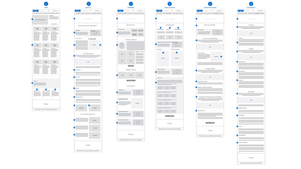
Primary structure proposed after all feedback had been collected and iterations presented.
VISUAL DESIGN
Unpacking the Walmart brand.
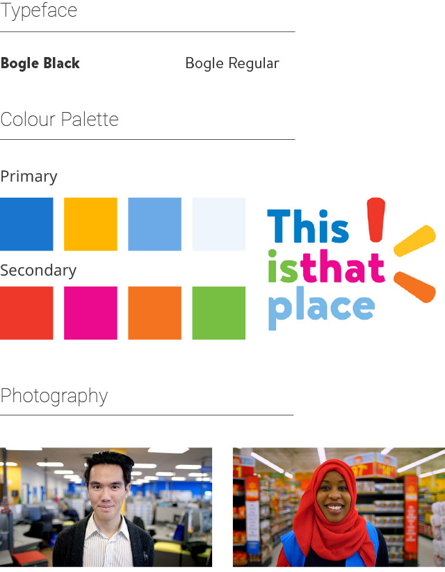
BogleWeb regular and BogleWeb bold was chosen to align with Walmart brand typeface.
The brand palette was made up primarily of corporate colours with access to a secondary palette derived from Walmart’s Associate Value Proposition ‘This is that place’.
Photography and video assets would aim to feature real associated in retail and head office settings.
The site re-design allowed us to focus on the following key objectives:
- Streamline content
- Reduce page count
- Promote and reinforce the Walmart AVP
- Minimize copy and leverage infographics
- Incorporate a mix of high impact mediums
- Develop simplified navigation paths
- Incorporate career site content
- Frame information around corporate narrative & Associate Value Proposition (AVP)
Development
I worked with Walmart’s CMS Product Managers to transition walmartcanada.ca onto a new CMS. This task involved migrating an archive of press releases and media assets dating back 10 years, and organizing the new content into the system while supporting multi-language localization.
CMS MIGRATION
One CMS to rule them all.
Walmart Canada needed to migrate from a legacy CMS to a newer release that the US site had implemented previously. We were granted an hour-long onboarding session to the CMS. Although my team and I had referenced the US site and based many of our overall design patterns around it, working within the constraints of the CMS proved to be far more challenging than first assumed. No access to source code proved to be a major roadblock, and to compound this challenge, the prebuilt patterns available within the CMS had no preview available. We were boxed in, and working blind.
Ultimately a combination of inline CSS and creative use of blank modules allowed us to create a reasonable facsimile of the pages as outlined in the approved visual design.
FINAL THOUGHTS
Earlier CMS onboarding.
In hindsight, our CMS onboarding needed to be far more robust. Although our process clearly calls for technical discovery and we did have brief onboarding to the new CMS, access to the right technical stakeholders at an early stage is not always possible. Clear understanding of the layout constraints could have happened much earlier in the design process, and our team would have verified design choices with the CMS product managers at every step with a much greater emphasis on rapid prototyping within the CMS itself.
Despite technical challenges, our team successfully produced a streamlined and impactful site that allows external audiences to easily explore Walmart Canada and quickly locate specific information. We’ve presented a cohesive Walmart narrative that is connected to the corporate vision, aligned to employer brand, and reinforced across all areas of the site. The site provides a candid view into all aspects of Walmart Canada from its operations, to its people, to its role within wider communities. The UX links the corporate site to the refreshed career site via complementary content, connected navigation paths, and shared messaging.

Contact me at chris@cgervais.ca