Created a design system from the ground up that is versatile enough to unify three historic legacy products, and flexible enough to adapt and scale with ongoing company acquisitions.
My Role
UX/UI Design, Design System Creation and Management, Component Library Creation, Accessibility Design, Responsive Design.
Bring consistency to a fragmented user experience to strengthen the TechInsights brand internally and externally.
TechInsights, a leader servicing the semiconductor industry has historically existed as separate platforms with individual teams maintaining their own source of standards for UI elements, components, modules, and datasets in both the front-end and back-end of these systems.
Common ongoing issues with the legacy systems:
Siloed development teams working with disjointed guidelines and direction.
Redundant components lack common standards.
Branding inconsistencies across platforms, websites and email notifications.
Non-existent accessibility standards.
Minimal attention to responsive standards and modern design foundations.
Project Goals
We needed a shared foundation to build upon.
Legacy product unification and ongoing acquisitions continued to perpetuate a fragmented user experience. This weakening of the TechInsights brand was jeopardizing the company goal of 100k platform users in 2023. An investment into a centralized design system was more important than ever.
How will a NewLY Centralized Design System help?
OUR BRAND IS OUR PROMISE OF QUALITY
Foster trust – A consistent experience is not only vital to our platform users, but with an increase in growth and acquisitions, TechInsights must also be trusted by our growing team uncertain of their place in a new parent company.
A BLUEPRINT FOR SUCCESS
Aligning our Teams – Internal growth, remote teams, and overall expansion require a clear blueprint to guide the building of and maintenance of our scaling product offerings.
INCREASE EFFICIENCY
Shared component and pattern libraries – bringing speed to both the design and development process to allow for faster design cycles, and reuse of components allow for shorter sprints.
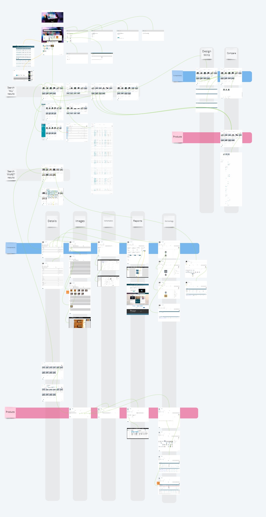
Inventory of the legacy products
TechInsights today is the result of multiple product mergers and acquisitions. Each merger brought new users and new products to the fold. Our understanding of the UX/UI decisions that came before us was murky at best. So to better understand the current state of our existing design ecosystem, we needed to audit the legacy UI.
We meticulously mapped our 3 legacy products to :
Document user flows
Identify inconsistencies in design assets
Identify commonality between patterns and components
Investigate accessibility and responsiveness
Legacy Product #1 – TechLibrary: The product was created for IP investigation, primarily geared toward patent defense and litigation.
Legacy Product #2 – Inside Technology: TechLibrary’s direct ancestor, created for IP investigation, primarily geared toward patent defense and litigation.
Legacy Product #3 – TisApp: The TechInsights reverse engineering product primarily used for competitive intelligence.
The process helped us clearly see all discrepancies and inconsistencies across our product and serve as a foundation for our design system work. By the same token we had a view of common components and patterns that would require unifications across the platform. It also made clear to us that in order to move forward, we would need to do some level setting and foundational design resetting.
Design System Foundations
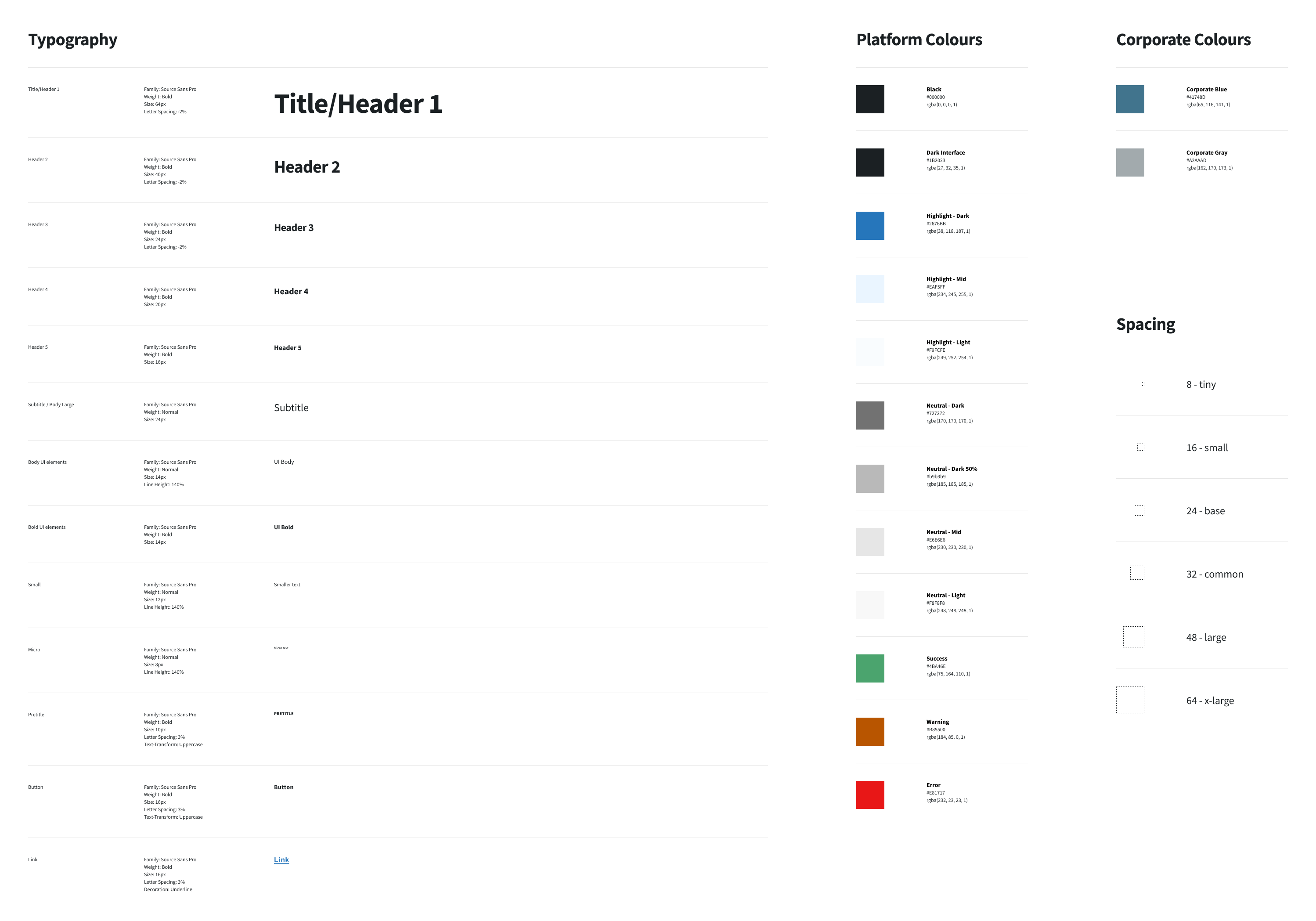
Critical to the success of the system was the alignment of all our products on the foundational elements for a unified platform. The system is structured to be scaled for each new acquisition, meaning that our foundational system needed to account for known and unknown UI elements. Our foundations supported our brand, grid systems, spacing scale, typography scales, color systems, and icon set.
Type, colour, and spacing: We chose a complete reset starting from the basic styles. Platform fonts were chosen for optimal legibility and character size at for small UI elements and complex tables. Colour systems were stripped down to neutrals and primary highlights, as well as basic system status. Spacing would employ 8-pixel increments to complement common device screen resolution
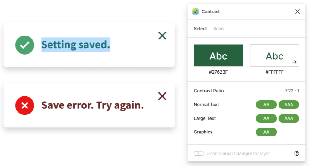
Common elements: Colour palettes and fonts were applied to the most common UI elements with a mandate of meeting basic accessibility requirements and have sufficient contrast values.
Icon sets: Standard icon sizes and styles were created complete with guidelines on usage, and naming conventions.
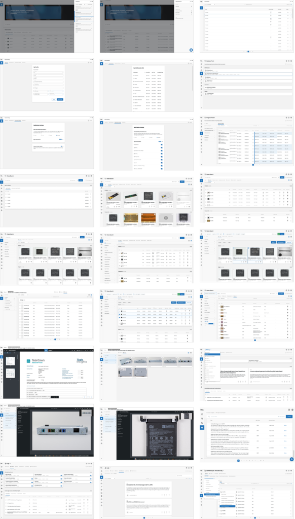
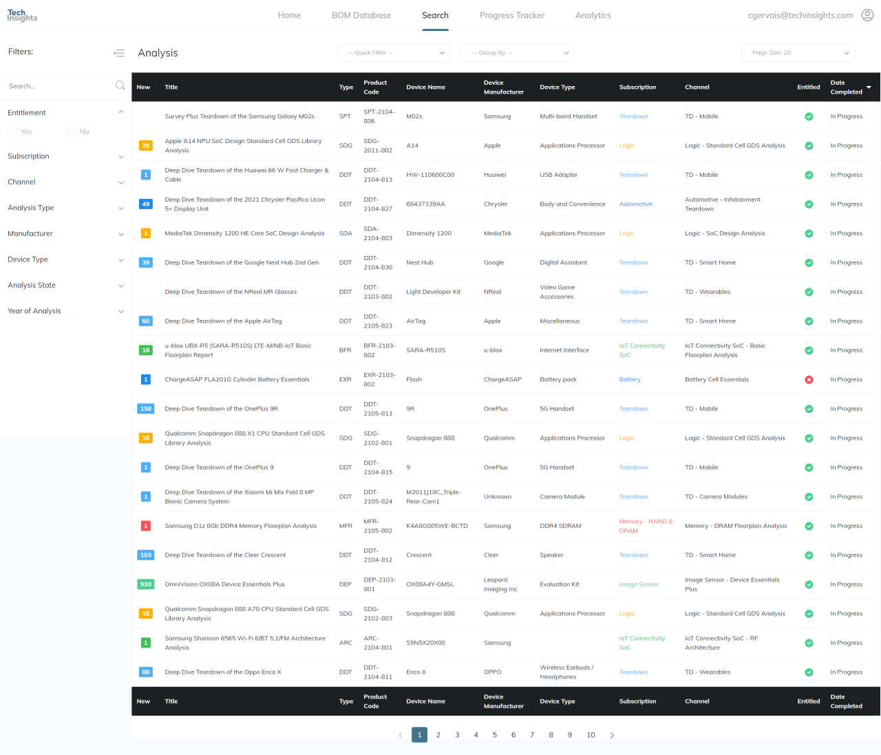
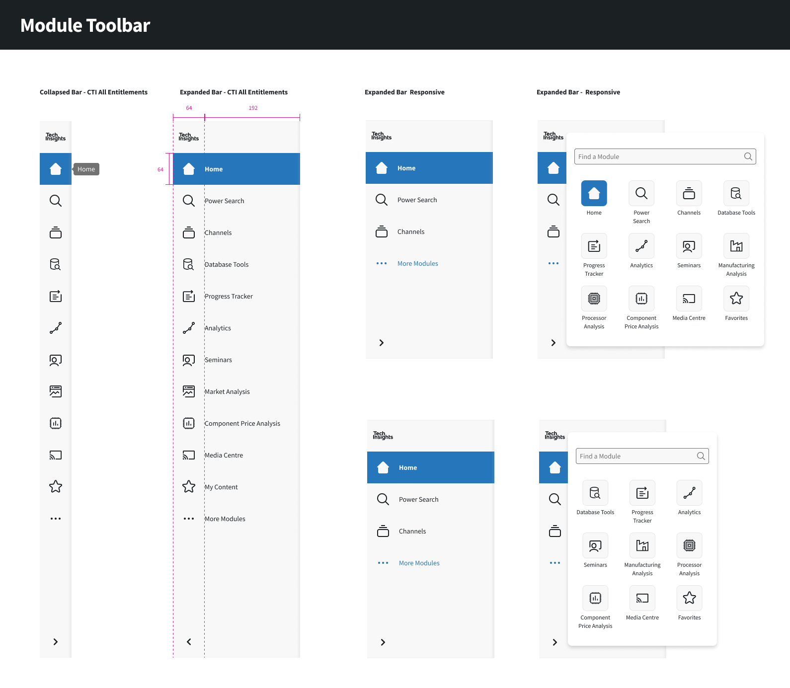
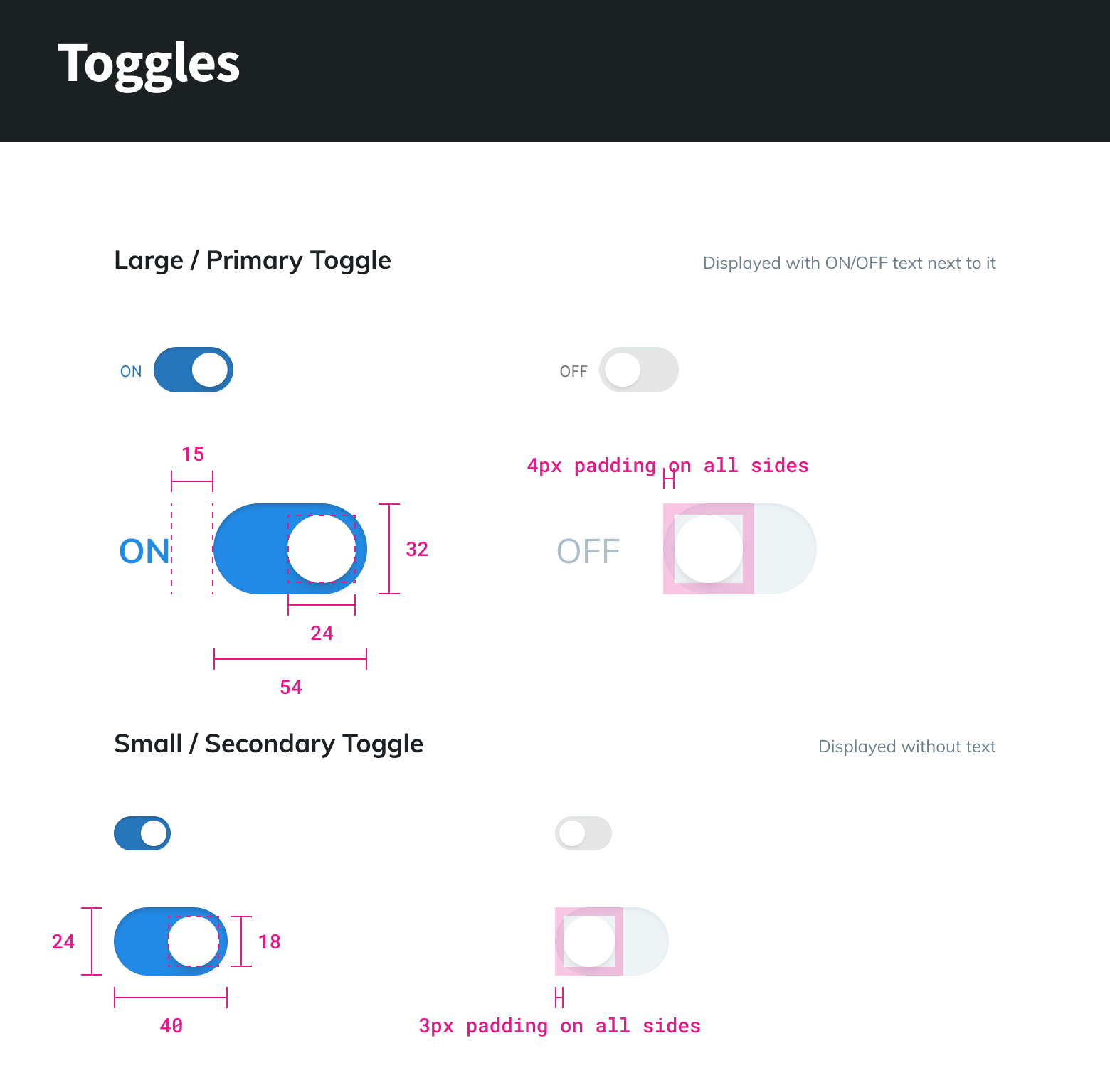
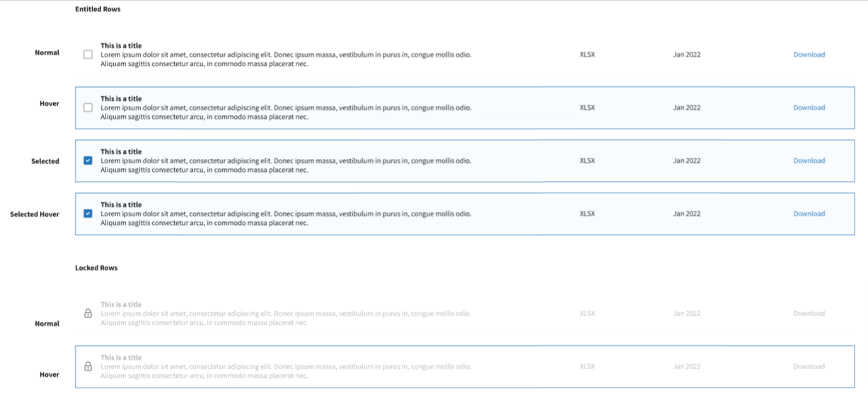
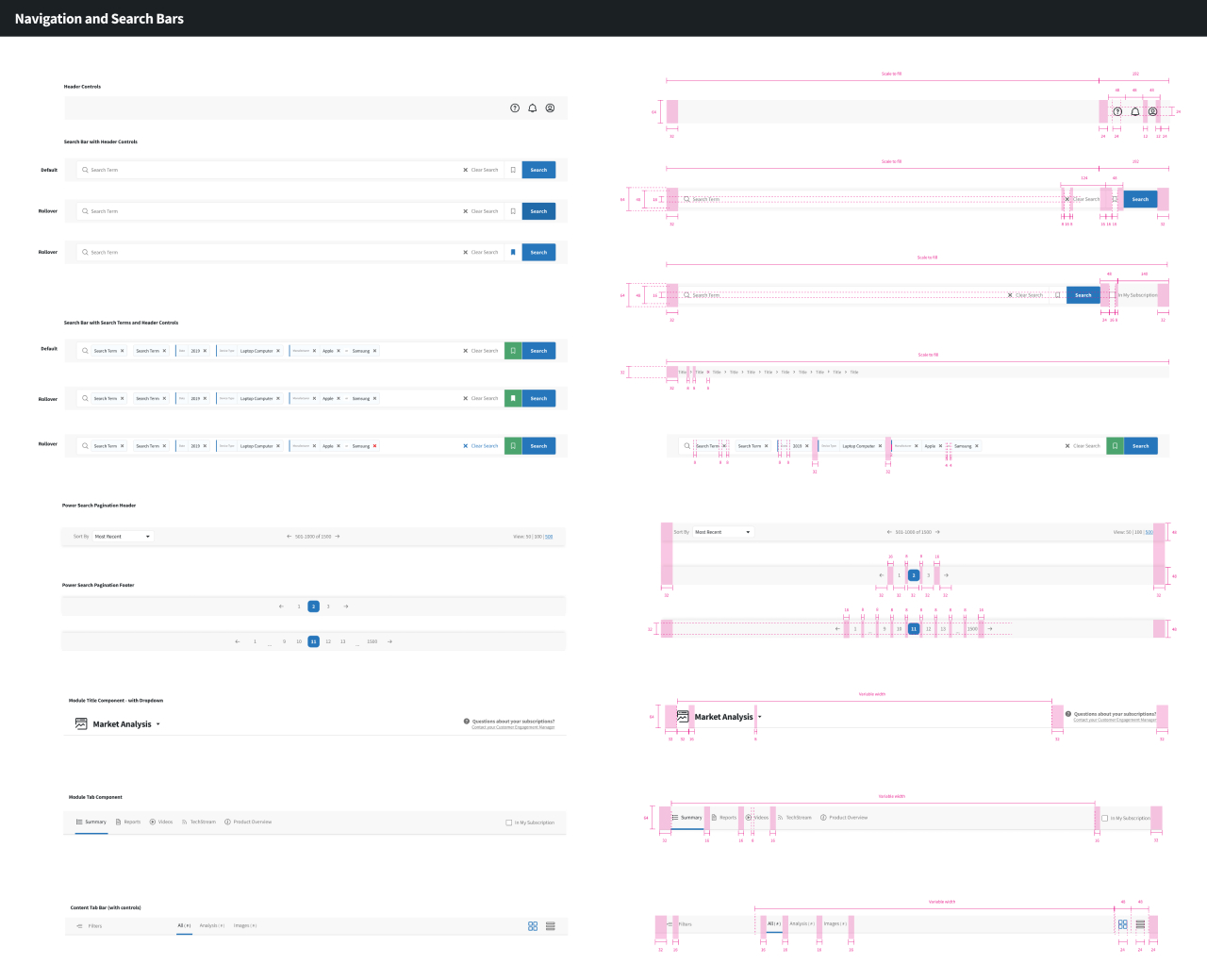
Component Library
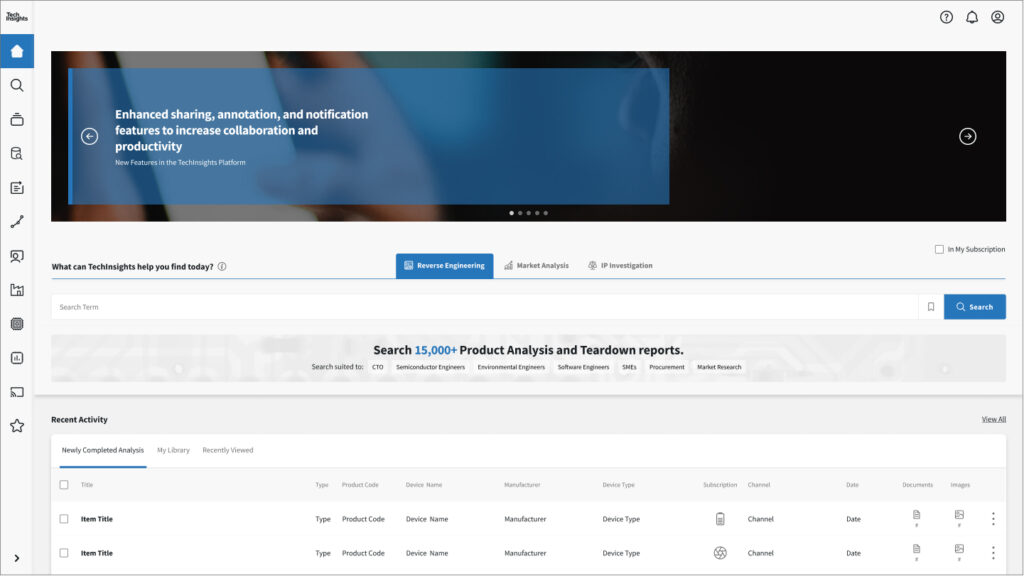
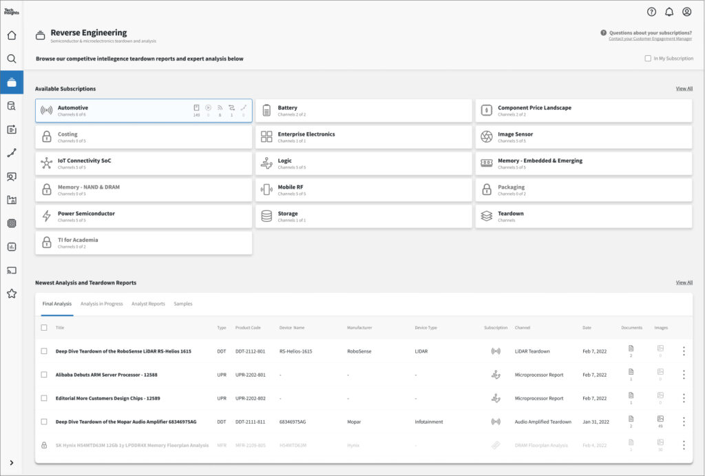
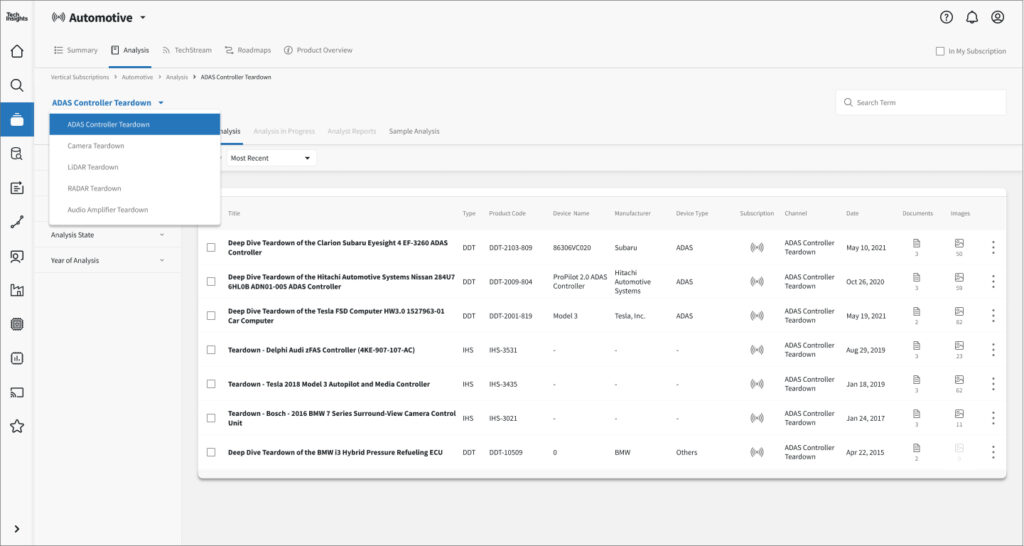
With the basics of our design system established, we began by creating a component library. This collection would serve to provide reusable interface elements. We collected common component types such as toolbars, cards, tables, and modals.
With continuous platform growth top of mind, our system aimed to be:
Modular
Scalable
Adaptable
Repeatable
To make our design team more efficient and so we could reuse assets when designing for different devices or layouts:
Components were created with Figma’s auto-layout feature.
Component included variants, and interaction “states”: rollover, focus, filled, tooltip, error, and disabled state.
Each component set needed flexibility in the UI and pixel accurate instruction for our developers to more easily implement:
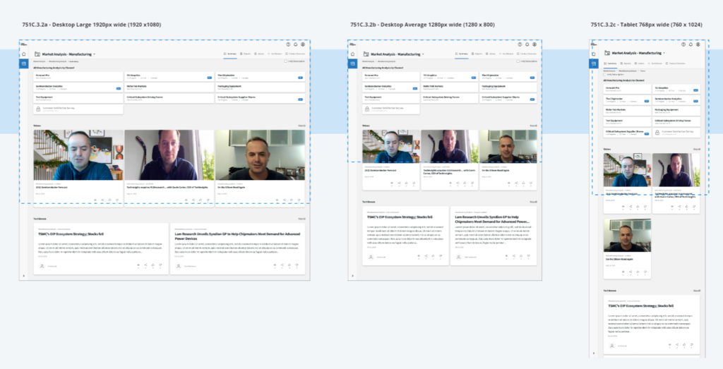
Responsive design stable to tablet
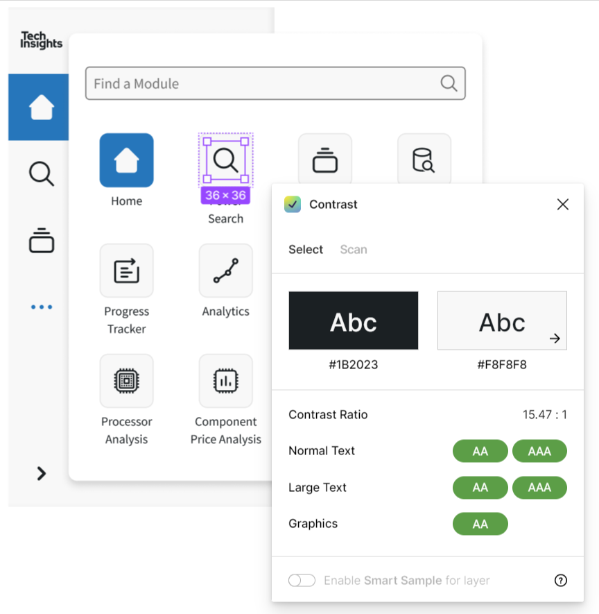
Minimum WCAG AA accessibility compliance
Contrast Values: We designed with accessibility in mind and strived to comply with WCAG AA accessibility standards.
Patterns
These were developed in consideration of growing and expanding the platform with new acquisitions and product offerings. These reusable combinations of components address common user needs.
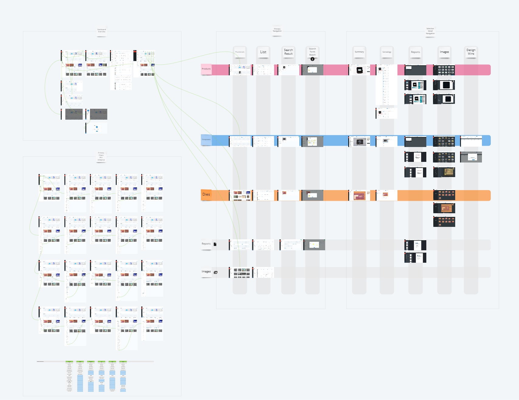
Sharing the design system - atomic blueprint
Any design system is only useful if it’s utilized and understood. We needed to share the design system, the common patterns, and the methodology to our product managers, developers, and company stakeholders. We also needed a common language for communication and documentation of common design patterns and components.
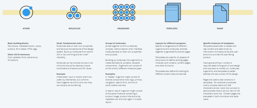
Atomic Design: to educate our design system users, we chose the Atomic Design methodology which breaks common UI elements down into their individual parts. These elements can be combined into more complex component sets while maintaining a standards.
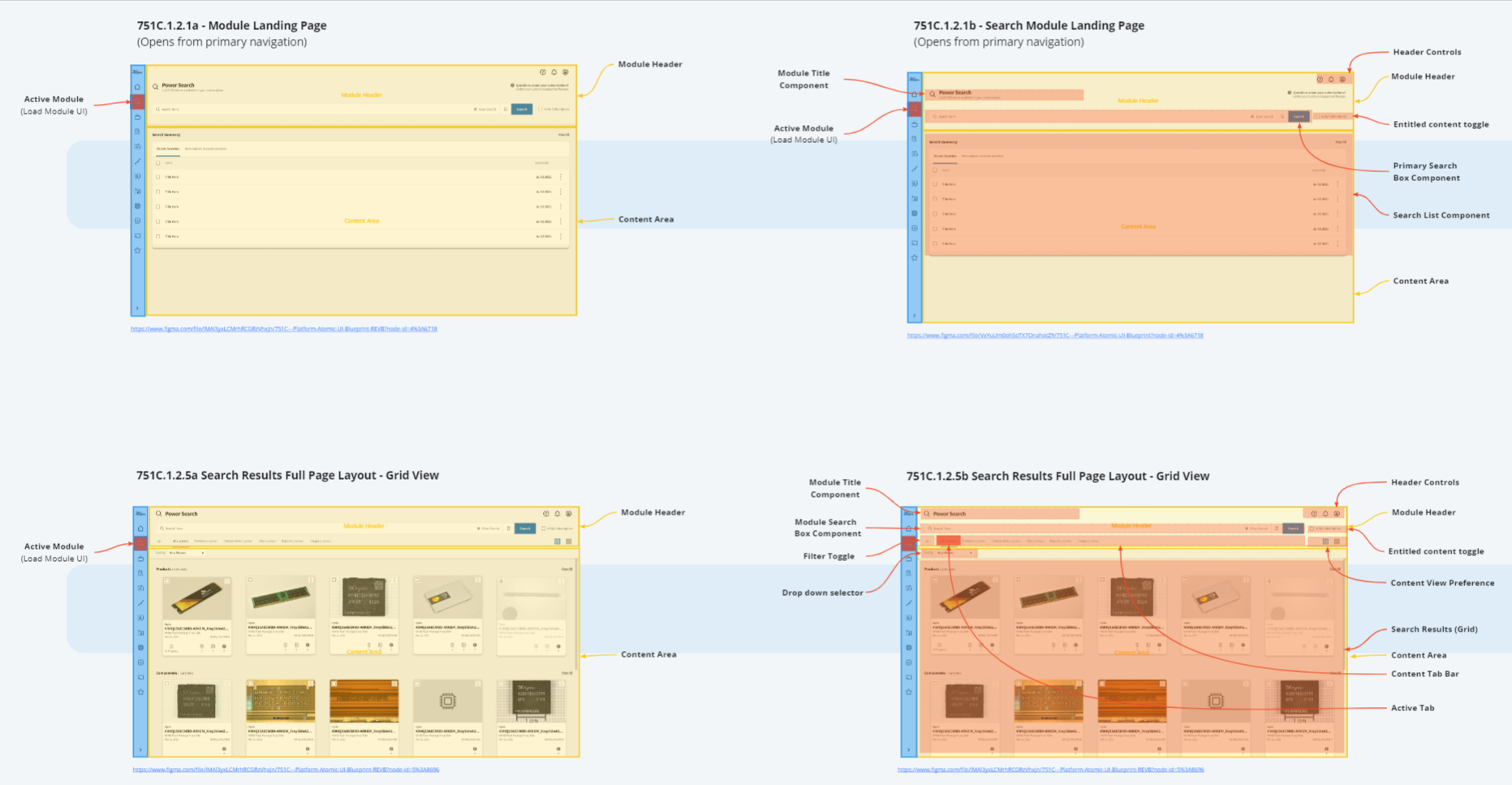
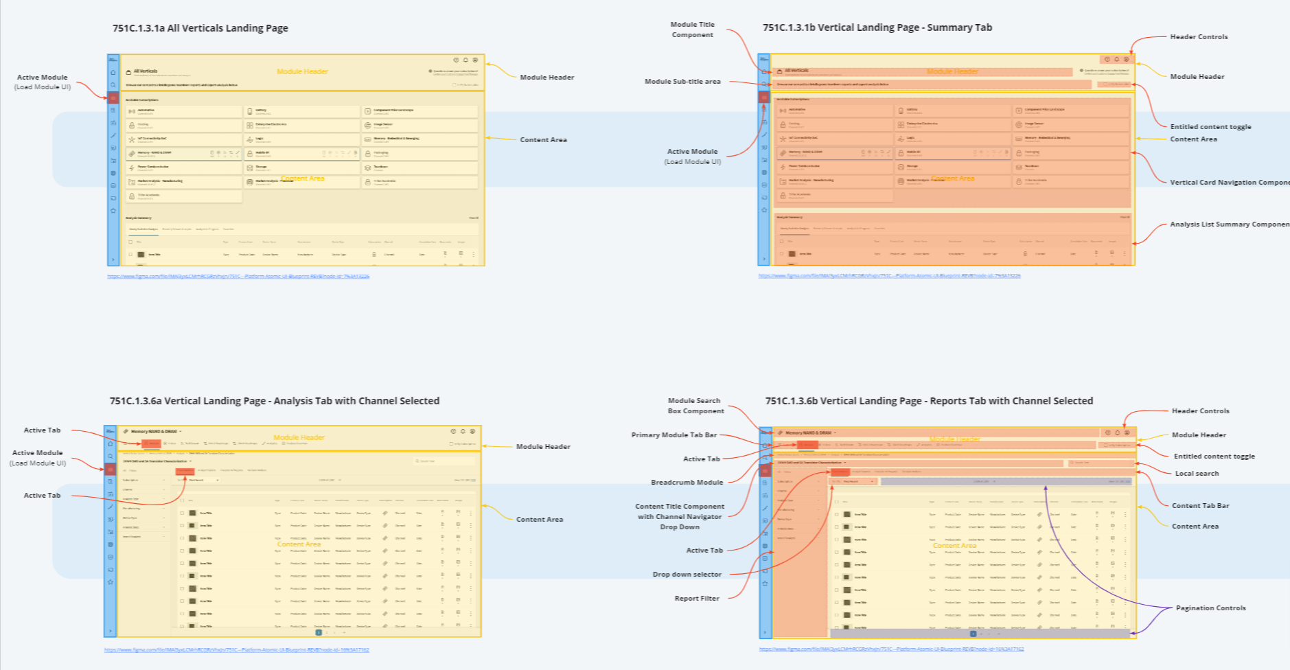
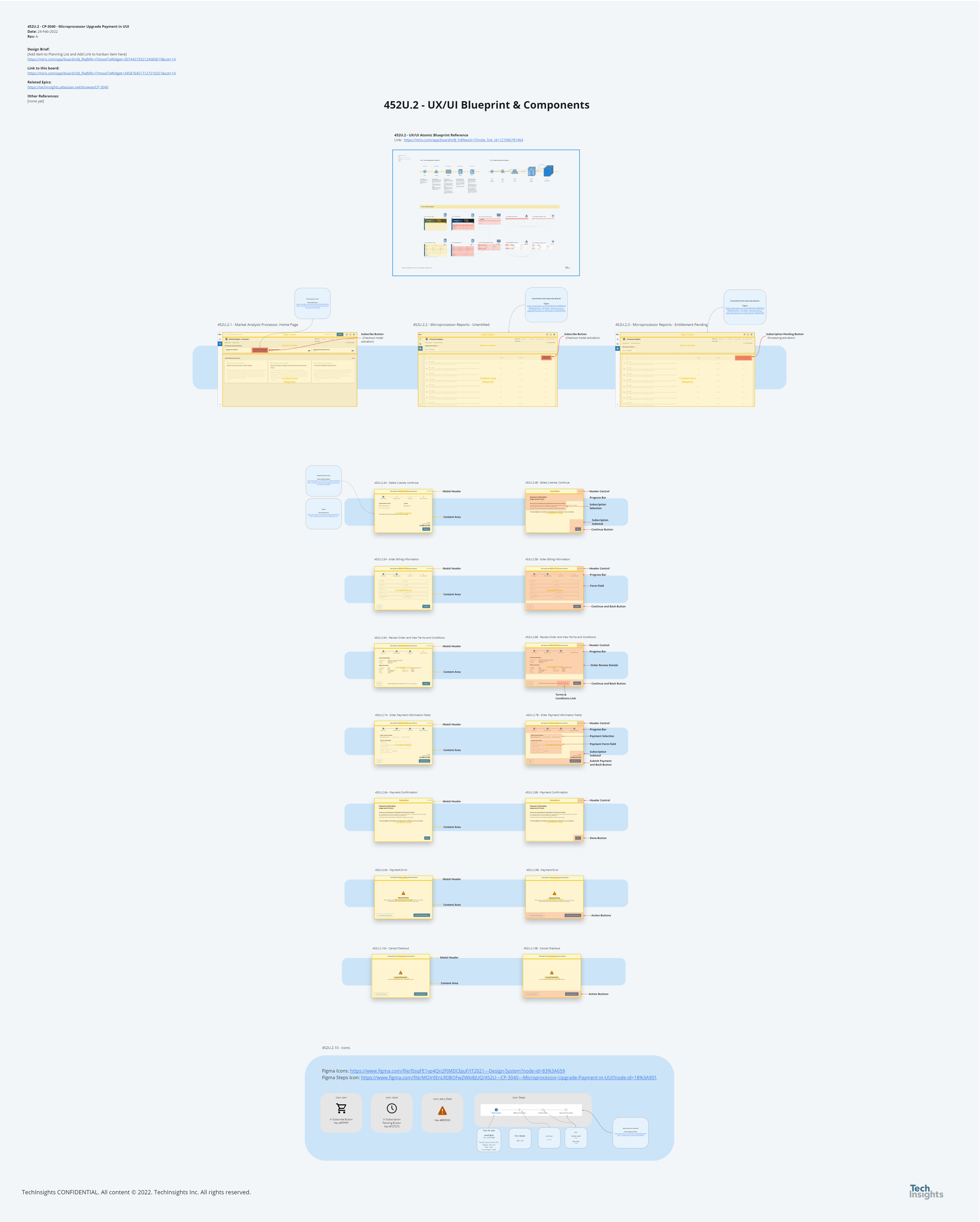
Naming conventions and standardization: Using Miro, we created a series of documents and blueprints so we would have a common standard set of labels for patterns and components. Each pattern was linked back to the high-fidelity Figma designs. The standards could be present in user flows and in handing off design targets to development team, or when generating user stories and acceptance criteria.
Responsive design: As part of our most common patterns, we aimed to include responsive design guidelines for our developers and to clearly show how different components and patterns would behave or transform at various screen sizes.
Our brand promise
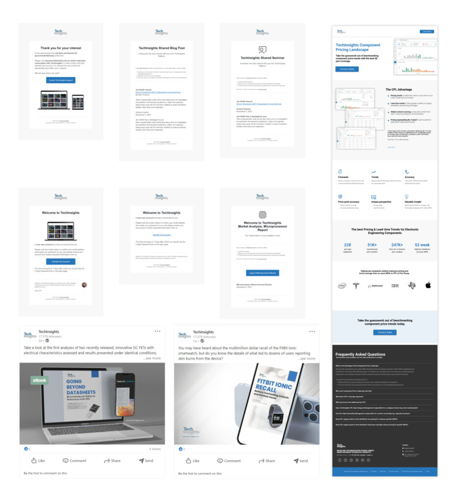
Now that our platform has a stable design system to build upon, it was more important than ever to look at the rest of our customer journey and related brand elements. Email templates were required, and an active effort to rebrand our corporate website, marketing outreach, and mobile application cannot be overlooked.
Email Templates, Social Media, User Engagement, and Web: Welcome messaging, subscription digests, new data alerts, events, and system notifications are but a few examples of the TechInsights email messaging systems. The brand must be consistent across all channels to truly build trust and user engagement.
Where do we go from here?
We built design system from the ground up in order to share a common design language and unified 3 legacy platforms and 3 platform acquisitions into a commonly recognizable and repeatable system. We provided education to our developers and internal stakeholder, yet a continued investment into this system is key so it can be adopted by any team moving forward.
Our design systems must be maintained and it must evolve:
Documentation, resources, and governance must evolve
Accessibility compliance must continue to improve
A greater emphasis on responsive design implementation so all components can function on all devices


