Background Research, Stakeholder Interviews, Competitor Research, Client Test
Re-Design
New Content, New Look, New IA and Flow
Enhance
Updated Messaging, EVP, Employer Brand
Stylize
Hi-Fi Prototype
Hand off
All assets to Dev team
PROJECT OVERVEIW
Career opportunities in aisle five.
Canadian grocer Sobeys Inc. sought help to modernize and reformat their career site as a multi-branded hiring portal for all of Sobeys national retail banners.
The site needed to inform candidates of Sobeys employee value proposition for roles in retail, distribution, office, pharmacy, and allow for direct job application.
The site would be mobile responsive and bilingual. My role was to research and provide information architecture recommendations, design wireframes, direct user flow by role type, reduce friction points for applicants, contribute to the visual design, and prototype new features.
Retail banners employing 125,000 employees.
8
Retail grocery locations and 350 retail fuel locations.
1540
Communities served across 10 provinces.
980
PROJECT GOALS
How might we organize the site to attract and engage best in class talent in key markets across the country and distinguish Sobeys as an employer of choice?
Showcase the Sobeys employer brand
Filter unsuitable candidates
Provide realistic job previews to set candidate expectations
Provide clear user flow to explore various roles
Reduce friction points to the ATS
Integrate Covid-19 related transparency and reassurance
Research
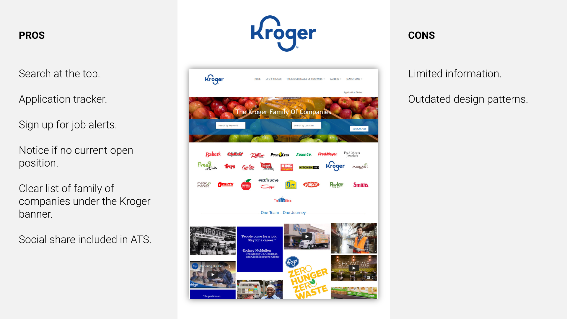
Leveraging compelling storytelling to answer ‘why work at Sobeys?’ research was conducted through an audit of the existing site, and a competitive analysis of Sobeys’ two biggest Canadian competitors. We also chose to review Kroger as the US equivalent to Sobeys, a national chain with multiple retail banners operating under the Kroger umbrella of companies. To help identify and validate design choices our strategy also focused on HR-related trends and key considerations when hiring millennials.
“Millennials comprise 50% of the US workforce in 2020.”
Understanding the visual design and user experience.
An audit of the existing site, coupled with a discovery session of CMS constraints helped to identify the following issues:
Outdated Design
The web page design is dated and lacks a clean aesthetic giving the impression that the user may not be on the correct portal.
Not optimized for mobile first
The site relies on breakpoints and the design is not handled in an elegant way. The site is not optimized for mobile-first users.
No max width display
The site does not have a standard desktop width and instead spans 100% of the browser viewport, further giving the impression that the site lacks quality.
Inconsistent information architecture
Job and department pages lacked a consistent, predictable layout making the experience feel disjointed.
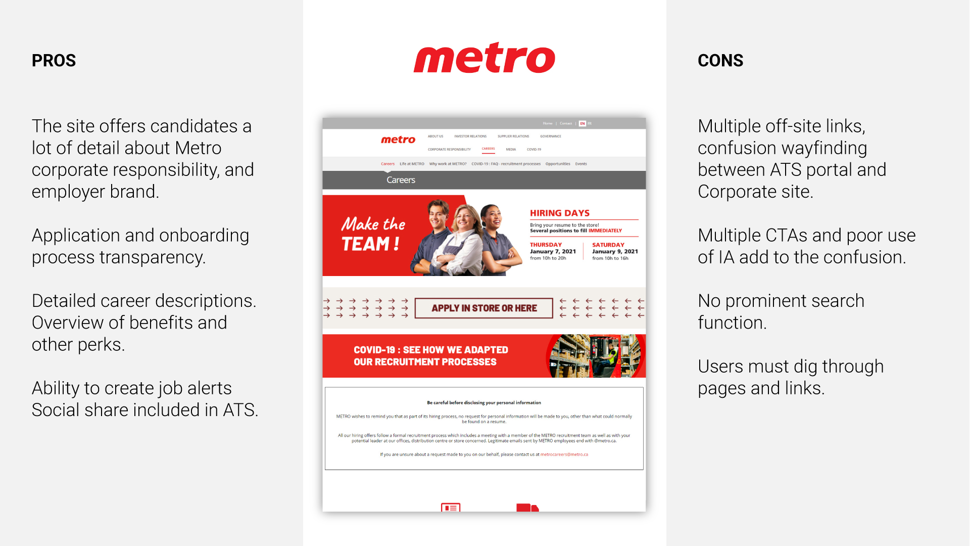
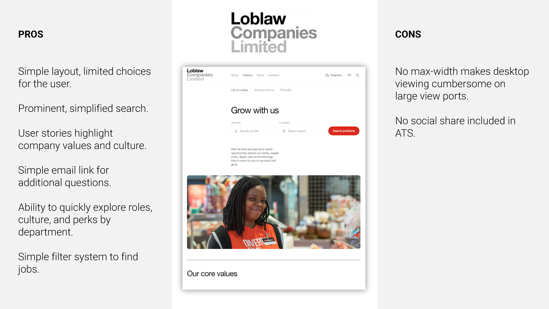
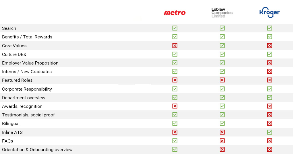
COMPETITIVE ANALYSIS
Unpacking the content, common themes, and key messaging.
To get a better sense of how to position Sobeys as an employer of choice, it was important to understand how other retail employers and grocers were representing themselves online. We wanted to ensure that our site would engage qualified candidates and encourage their application, while clearly showcasing Sobeys’ value proposition to employees.
Intake questionnaires helped in discovering the benefits/differentiators across each department, in the employee’s own words. Short questionnaires were circulated across retail, corporate, distribution, and pharmacy.
Retail questionnaire example
Department specific questions
Provide 2-3 key descriptors about what it is like to work at Sobeys Inc. on a daily basis in a retail capacity?
What kind of person thrives at Sobeys Inc. in a retail capacity? Provide 4-5 characteristics in terms of personality, energy, aspirations, etc.
Provide 4-5 reasons why you think people choose to work in retail at Sobeys Inc.? What do they like about it?
General
The market is very competitive – what key differentiators set apart retail at Sobeys Inc. from others both inside the retail segment, and beyond?
Tell me about the people culture in retail positions at Sobeys Inc. as compared to your key competitors?
What kinds of investments is Sobeys Inc. making in retail in terms of people, process, technology, or otherwise?
What are some of the biggest myths/misconceptions that should be dispelled regarding positions in retail in general and particularly with respect to Sobeys Inc.?
Please feel free to include any other information that is relevant and was not requested above.
“80% of millennials and Gen Z say making the world a better place is one of their top priorities.”
Understanding millennial motivations and the changing workforce.
Content needs evolving
Employer value proposition (EVP)
Customer-driven
People-powered
Community-engaged
Results-oriented
Student hiring
High-quality photography
Content needs enhancing
Key messaging
Testimonials
Social proof
Employer brand identity
Visual look and feel
Content needs developing
Job families
Retail Hourly
Distribution & Logistics
Pharmacy
Benefits
Social responsibility
Diversity & Inclusion
Video content
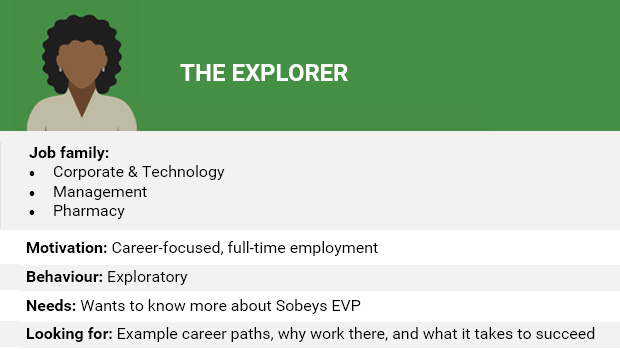
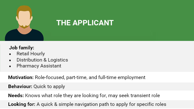
PERSONAS
Defining our Broad Scope Personas.
Todays workforce is comprised of Millennials, Gen Xers, Baby Boomers, and Traditionalists
Design
Our guiding principles
Minimize copy
Incorporate a mix of high impact mediums (visuals, video, podcast)
Adopt a user-centered design approach
Develop simplified journey maps
Integrate EVP messaging & creative
Explore best/next practices (chatbots, visual job descriptions, live hiring manager)
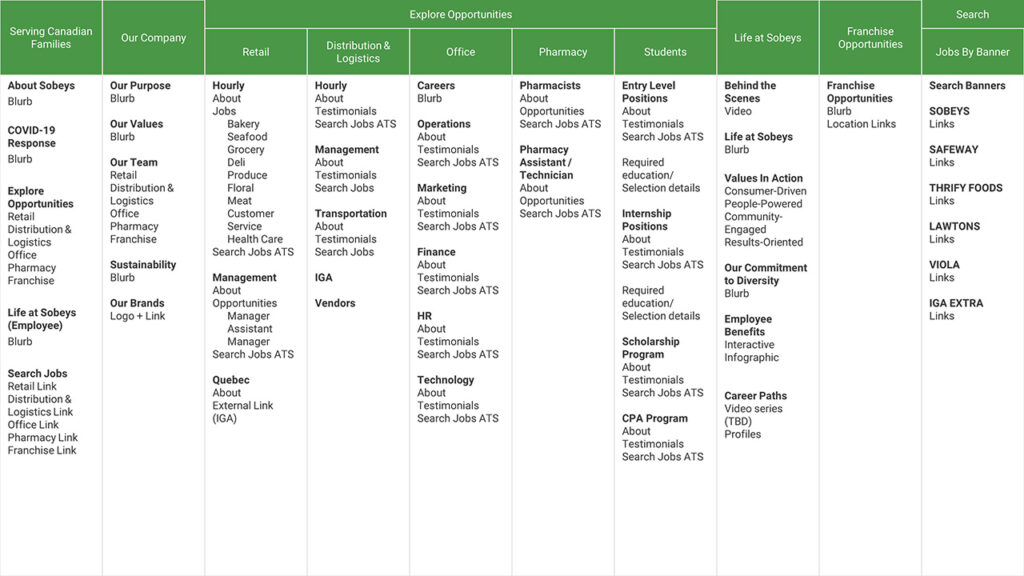
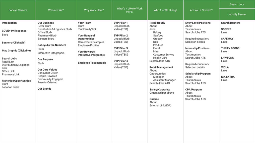
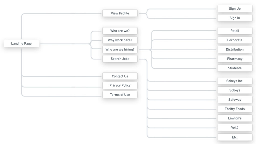
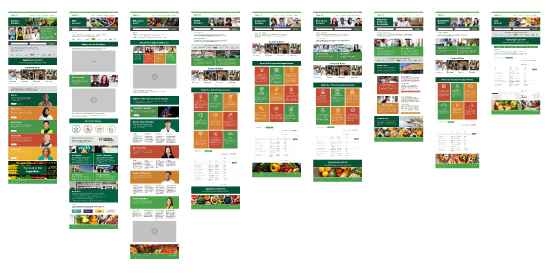
INFORMATION ARCHITECTURE
Organizing the content.
Our team initially explored two separate site structures using the following ‘how might we’ statements. Card sorting exercises helped our team group and categories the various sections we hoped to offer to candidates.
1) How might we allow applicants to browse opportunities by job family and gain a birds-eye view of the Sobeys career path structure.
2)How might we structure navigation based on the common questions and areas of interest users may have.
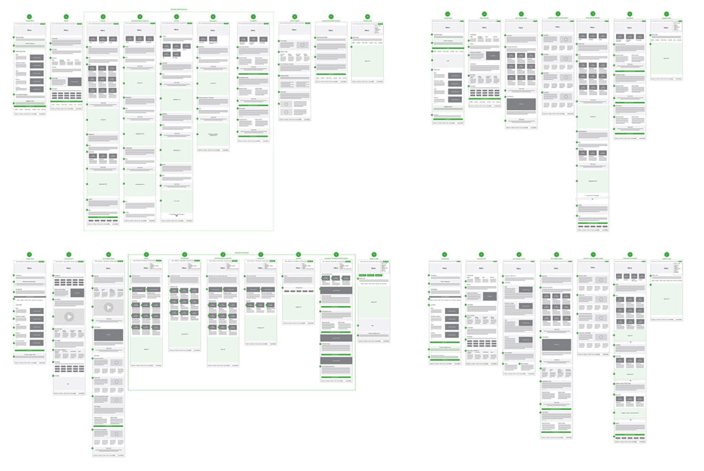
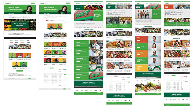
WIREFRAME ITERATIONS
Getting the content right.
We continued this exploration through various iterations, numbering wireframes and page sections for easy reference and annotation, and to allow both our stakeholders, and copywriters, and developers to refer to specific sections by number.
After all of the feedback had been collected and wireframe iterations presented, a direction was agreed upon.
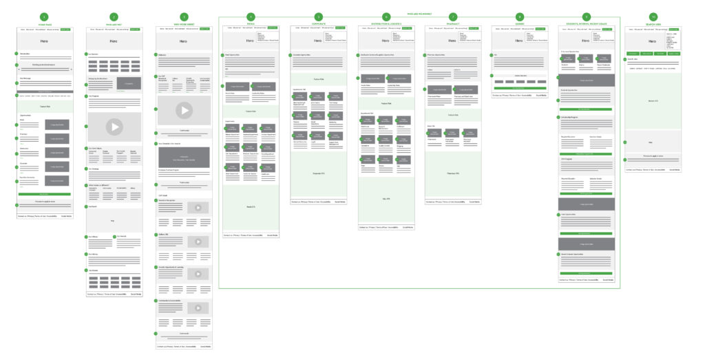
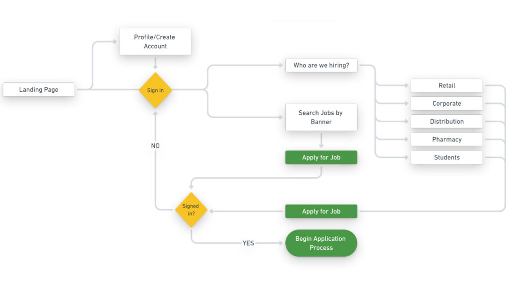
SITEMAP AND FLOWS
Understanding the user journey.
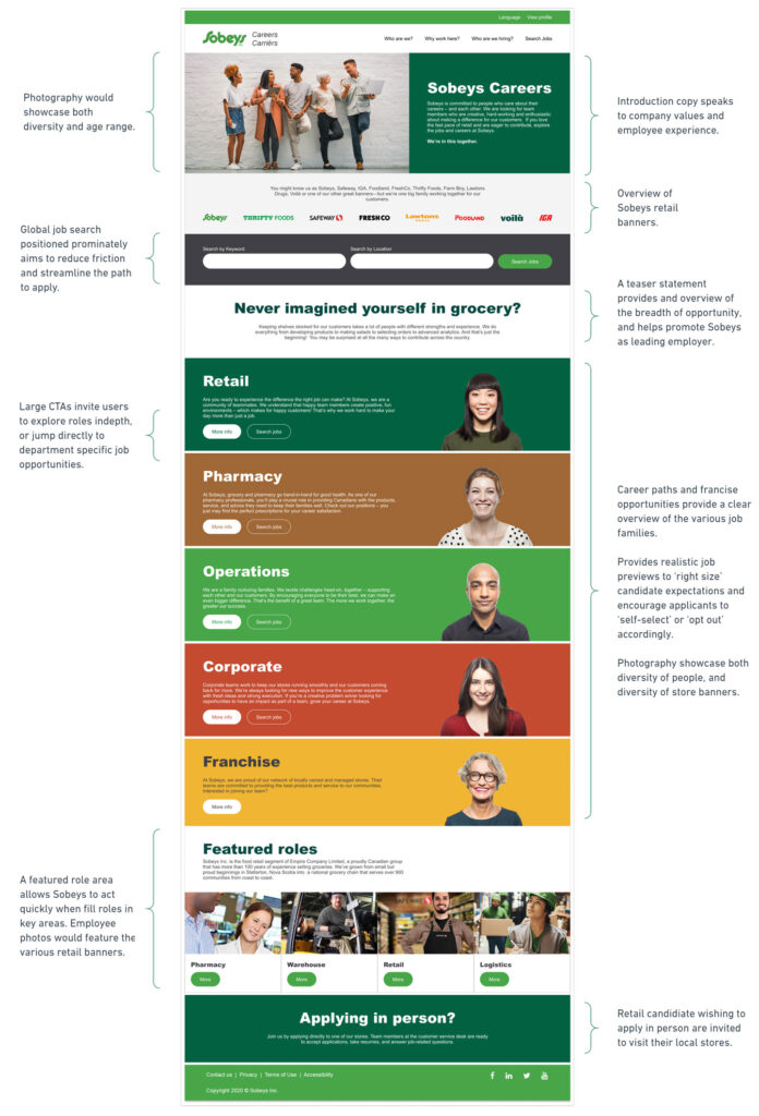
Working closely with Sobeys HR and internal developers, a structure was proposed with clearly labeled departments in four main career paths – retail, corporate, distribution, and pharmacy – while eliminating redundant sub-section and pages. An integrated ATS and search function make it easy for applicants to find roles by keyword or location and set job alerts.
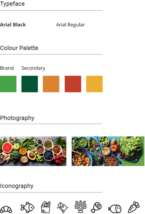
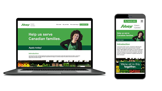
VISUAL DESIGN
Establishing the styles.
Arial was chosen to be highly accessible to site visitors and best align with the constraints of the CMS the site would be developed on.
The brand palette provided direction but would require some adjustment to meet AODA contrast compliance.
Photography that complimented the brand palette would be prioritized.
Iconography using a light outline format would be chosen to match the various retail, corporate, and warehousing departments.
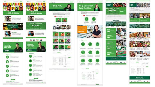
Iterating on the visual design.
Multiple designs were explored by our team and tested with the client.
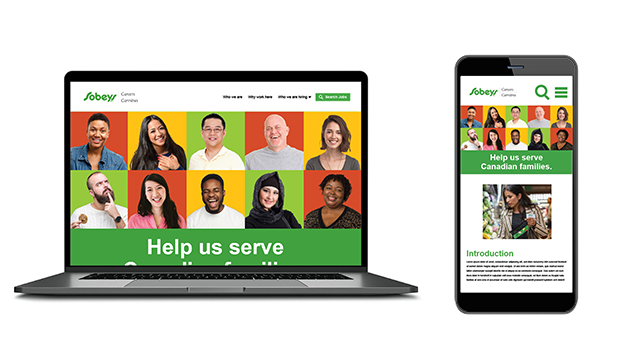
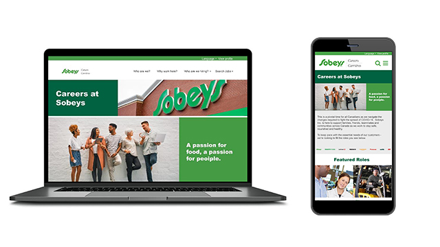
PROTOTYPE
Test driving our solution.
The site uses a responsive design based on a 12-column structure.
Developer Handoff
Our team prepared all the hand-off materials in accordance with the developers’ specs and answered any questions about the design or functionality of the website. The site is currently with the developing team, and a go-live date is yet to be determined due to client-side internal priority conflicts brought about by Covid-19.
FINAL THOUGHTS
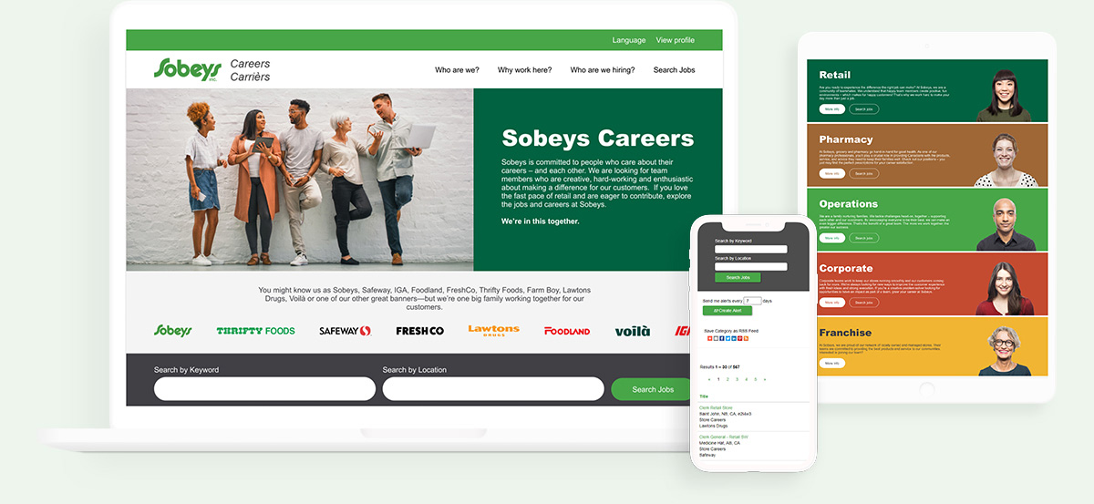
All visual elements have been brought inline with Sobeys primary retail website, so the main retail brand and career site experience feel cohesive. Featured roles are displayed prominently on the homepage and are also filtered by career path or individual career path, so Sobeys can act quickly to fill key positions – such as the need for additional drivers and warehouse workers during the COVID-19 outbreak. The site design is now streamlined and persona-driven, offering candidates the ability to see the Sobeys enterprise at-a-glance and easily apply to available roles across the country. Candidates can explore departments and roles with additional detail, and the ability to apply is always present.
Ultimately the site re-design delivers our key objectives:
Enhancing talent effectiveness for top priority banners & job families
Promotes a refreshed brand & EVP assets to support talent attraction
Providing realistic previews and a candid perspective on ‘life at Sobeys’